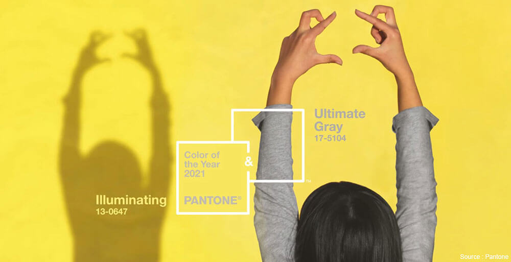
Pantone’s Color of the Year: A Dynamic Duo
Colors have an immense impact on our bodies and spirits. It’s no wonder that we’re drawn to certain ones in every area of our lives. Different colors affect our mood, well-being, and even our motivation and perceptions. That’s why each December the tastemakers at Pantone unveil their star shade and set the tone for the year ahead. For the second time in its history, Pantone has surprised us by selecting two colors for 2021: Ultimate Gray (17-5104) and Illuminating (13-0647) yellow.
Inspired by the uncertainty of 2020, this decision is no accident. About two dozen people determine which shades will make the short list each year. They observe the trends and developments in multiple industries including cars, fashion, restaurants, food, and sports. In short, everything around us.
An inspiring combination
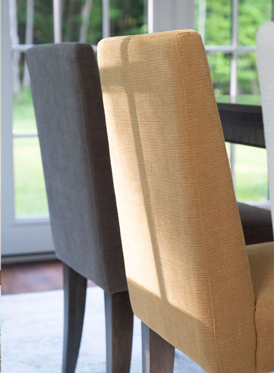
The choice may surprise you, but when you think about it, gray and yellow actually go really well together. Too much Ultimate Gray on its own can look a bit subdued. But it’s the ideal backdrop to make an accent color like yellow pop, showcasing both hues in the process. It’s the perfect example of the whole being greater than the sum of its parts. Together, the two intensify one another.
A versatile pair
This combination of mousy gray and sunny yellow is easy to incorporate anywhere in your home, from your decor to your table. These simple, punchy colors work well with both masculine and feminine styles and suit just about every room.
A solid color
Neutral, reassuring, and familiar, gray inspires resilience, endurance, and strength. In addition to those admirable qualities, it stands the test of time. Suitable for both walls and furniture, gray gives your home a sophisticated look. It’s also the perfect color for sidestepping decorating mistakes. You can’t really go wrong with gray! For example, materials like concrete and granite never go out of style. Not only is it everywhere and easy to match, gray is calming, so it’s the ideal choice for creating a welcoming home. It makes you wonder why this is the first time Pantone has named gray the color of the year.
A hint of sun
This is the second time yellow has been chosen. With the warmth, optimism, vivacity, and positivity it conveys, this shade is famed for its ability to lift our spirits and energize us. It’s impossible to be gloomy when you’re surrounded by this warm, lively color! It also symbolizes success and joy, and instantly adds some sun to any decor. You can include it in any room because even though it dazzles, yellow is still soothing and reassuring.
Here are some tips on how to incorporate both colors in your home:
Here and there
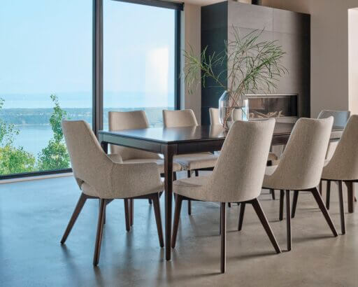
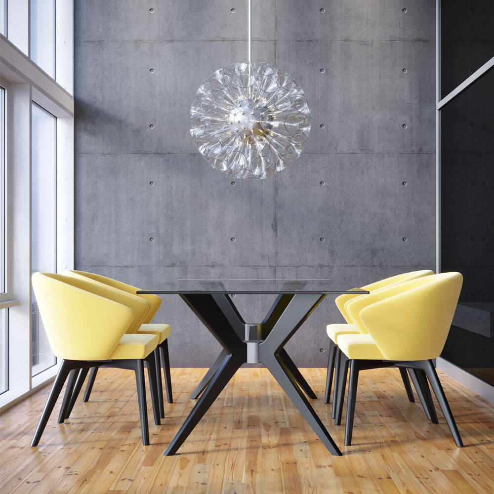
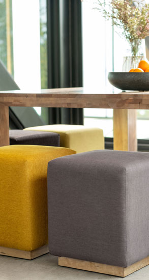
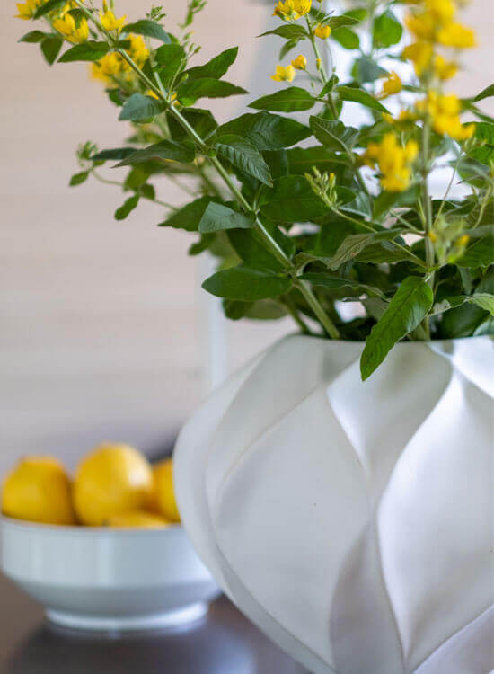
One effective method is to use both colors sparingly. You can create a big impact without overdoing it. The secret is to choose gray as the base and liven things up with yellow accents. Adding colorful accessories makes it easy to change your style with the seasons. For instance, you can place throw cushions in this sunny hue on a gray couch, or put a lovely vase filled with yellow tulips on a side table. It’s as easy as that. Employing a less-is-more strategy highlights eye-catching pieces and creates a captivating, warm decor. You can use gray for the elements you don’t change as often, like walls, floors, and big pieces of furniture. That way, you have a neutral, timeless base to work with so you can change the look of the room easily. However, if yellow really thrills you, we suggest using it on a large scale in one of the liveliest rooms in the house—the dining room!
Combine them with other colors
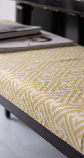
While we love this unique duo, you can also have fun with the other colors of the rainbow. In fact, we even recommend it! These two warm tones pair beautifully with black and white for a more modern style, or with beige and wood tones for a boho look. Gray and yellow also go well with dusty rose, green, violet, or powder blue for a very urban esthetic. Since it can be tricky to know what color combinations look good, why not let decorative items with patterns do the work for you? Prints are a great way to mix and match colors. Use a throw, curtains, or a rug. If you want to make a statement and use gray and yellow from floor to ceiling, go for it, but add metallic and black accessories to balance out the colors and give your room a touch of refinement.
Remember that these shades are suggestions, so feel free to use a more varied palette. You can use the shade of yellow or gray you like, as long as they go together well.
Mix textures
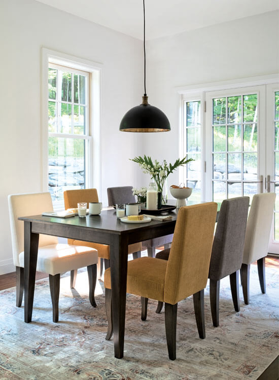
To blend colors smoothly, softness is needed. And what’s softer than velvet? We love its cozy side, which gives gray richness and warmth and yellow depth. Choosing one key element to do in velvet is a very on-trend way to find the dynamic duo a place in your home. To avoid going overboard, pair dining table chairs in yellow velvet with a table made from aged wood. Don’t be afraid to play with the different elements of a room. It’s the best way to give it character and avoid the trap of making everything too matchy-matchy. Beginners should read our blog for tips on mixing and matching. For monochrome enthusiasts, choosing different textures in the same tones is a clever way to create a simple, uniform, and elegant space.
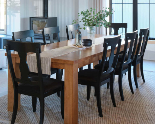
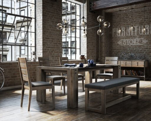
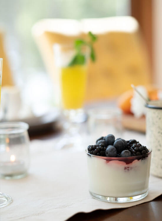
Liven up your table
If there’s one place where every color is welcome, it’s on the table. Nothing beats delicious dishes made from tasty ingredients and an attractive table set and decorated with a colorful centerpiece. It’s without a doubt one of the easiest and best ways to incorporate the latest trend in your home. Take out your gleaming silverware, add beautiful sunflowers or tulips in a vase, and pour some sparkling mimosas. It’s that easy!
More than just colors
We often associate the new year with renewal, change, and fresh starts. Many of us wait impatiently for this time of year to refresh our wardrobes and our decor. While the colors Pantone chooses each year certainly guide our choices, they’re much more than just sources of decorating inspiration. The pair chosen for the 2021 Color of the Year evokes strength and positivity. They motivate us to come together and support one another, but also to be equally powerful on our own! These two surprising colors strike a perfect balance together. So, get inspired! Be fearless, tenacious, and optimistic. And have fun creating an eye-catching decor that brings you warmth, stability, and joy!