Code blue
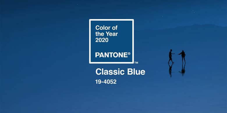
It is known that trends are cyclical, that they often make a comeback after a few years. Fortunately, some of them never return while others reappear regularly, transforming according to the seasons and the passing of time. The new Pantone 2020 colour is the perfect example. It was in 2000 that the history of the Pantone Colour of the Year made its appearance, with the blue cerulean as the star colour. This colour represented the beginning of a new era and was intended to guarantee serenity and peace for the new millennium. Here we are now, 20 years later, after the creation of this franchise with the classic blue as the colour of the year to close this second decade of the 21st century.
It is, therefore, no surprise that the master of colour has revisited this palette of colour that inspires change for this new phase. The Classic Blue 19-4052 embodies calm, confidence, stability, credibility. The hue also recalls the sky at dusk, an inspiration to which many people identify and associate with a sense of unifying and security. Yes, it is a serene and calm colour, but it is also vibrant and a sign of assurance. So dare the colour blue in all its forms and variants, in all facets of your life! Why not start with the decoration? Our home represents everything this colour inspires. It is the place where you meet with those you love, where you feel the safest and where all craziness is allowed, without judgment! The greatest interior designers love this new hue and you will quickly understand why!
A Timeless Colour
The colour palette associated with the flagship colour comes in several variations. Intense, vibrant and radiant, the colour of the year invites itself into your home with audacity, positivity and enthusiasm. The easiest way to integrate the trend is, of course, to apply this new colour on a wall. It’s a simple and hassle-free way to add character to a room. A successful decoration is largely based on the touch of colour you choose, but it’s not always easy to make a wise choice. Rest assured, the Classic Blue is, as its name attests, a classic. It is timeless, pairs with several other shades.
See Life in Blue
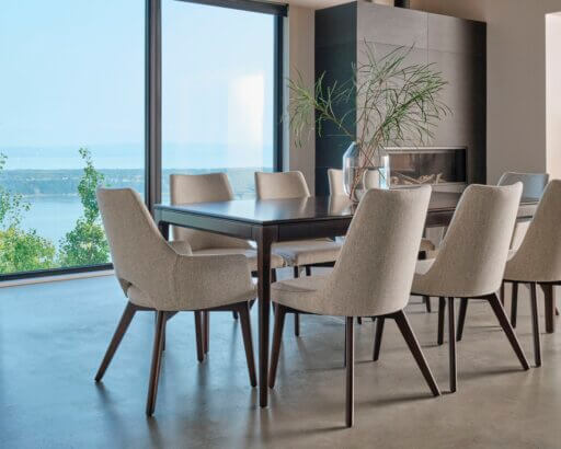
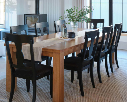
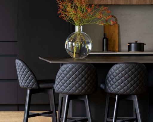
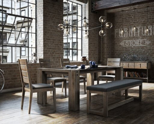
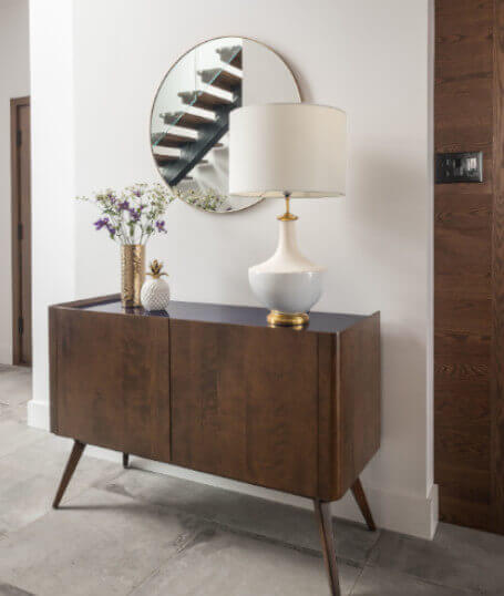
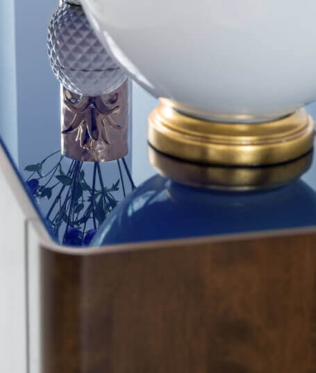
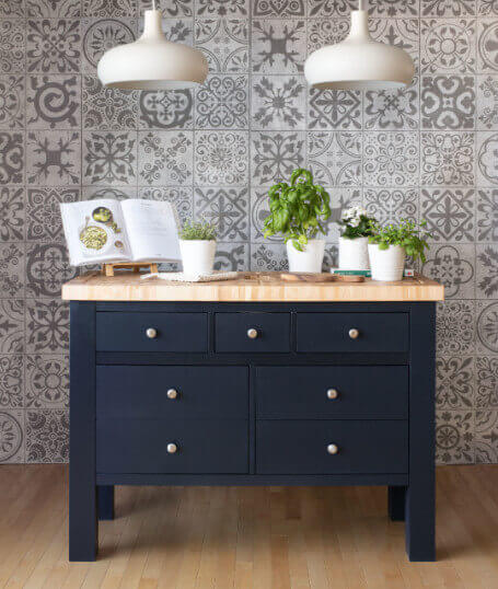
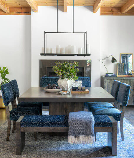
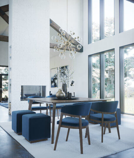
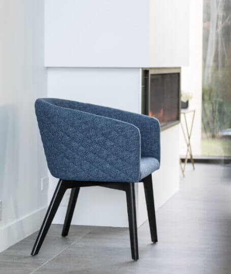
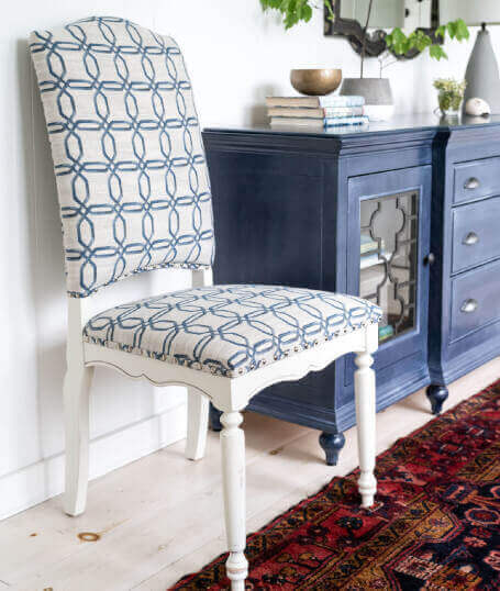
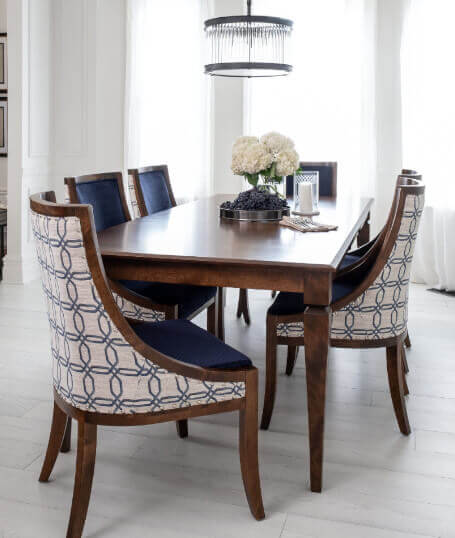
Since this colour is not too risky and we certainly won’t get tired of it any time soon, why not incorporate it in a more creatively. Although the white and clean interiors have been popular in recent years, a return to the accents of rich and vibrant colours is felt. So go ahead and dare this famous Classic Blue for furniture and accessories. We are thinking here of a beautiful kitchen island of this harmonious hue that will certainly brighten up your time while cooking. Simply put, you can choose beautiful stools with blue seats. In the dining room, the possibilities are endless: velvet padded chairs for the dining table, a bench with cushions printed in blue damask or a buffet painted in this deep hue. In the living room, you can go all out with an imposing sofa accompanied by an ottoman of this famous Classic Blue. For carpets and accessories, choose ones that feature the same hue to create a link with the main element for sleek and harmonious decor. Otherwise, you can always go with a complementary colour for the accessories, as suggested above.
A Shade for Everyone
In an era where “the beige life” pervades our social networks, it can be somewhat confusing to incorporate such a strong and imposing colour into one’s daily life. So here are some simple ways to make room for this trend, depending on your personality.
The Lady in Blue
Use o shades of blue: one softer and the other more intense to create a consistent contrast. Pair these blues with more feminine colours such as plum, burgundy and old pink to give a romantic, glamorous and relaxing look to the room. As for the decorative elements, choose carpets, curtains, ottomans and decorative cushions.
A Modern Classic
Here the classic blue is seen almost as a neutral colour. Just like jeans that you can wear with anything. It is classic and modern at the same time, timeless, but renewable according to what is arranged alongside it. To integrate it well, we choose a franker hue of blue, more electric, that we apply in smaller quantities. For example, a beautiful padded velvet loveseat with a hanging tinted glass light fixture. Opt for items with clean lines, without too many frills. Continue the look with either neutral colours such as black and white or a small touch of green or yellow. We want the blue here to remain the star of the room. You can complete it with a few golden elements, such as a standing plant pot, a table lamp or a few frames and vases.
Mix and Match Trend
The key to this style is the texture. We want to achieve an eclectic but coherent decor by mixing different patterns, shapes, textures and hues. It should still be kept in mind that the shades must be variations of blues only, paired with very neutral colours (grey, beige, black, white). Imagine a cobalt blue armchair with a few cushions with tartan, Aztec and lined patterns. This kind of look is best in a room where the walls are painted in a light colour and where the furniture such as coffee tables, buffets and storage is made of natural wood of sober colours. The result? A trendy and contemporary room guaranteed!
A New Era
The colour of the year comes from the horizon between the sky and the sea, which inspires an infinite calm. In 2020, we take a break. With the hectic and chaotic world in which we live, we return to our roots, to what matters. We take the time to question ourselves; to think about what is important, what makes us feel good, what soothes us. It is the time to feel confident, to dare, to assert yourself. Whether adopted in an affirmative or rather conservative way, this colour is a promise of simplicity and elegance that will certainly make its place, in its way, for everyone’s life. It is not for nothing that blue is the most favourite colour in the world!